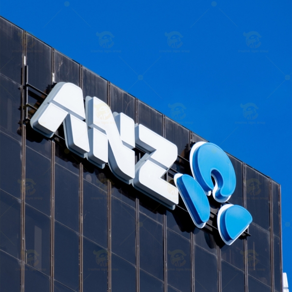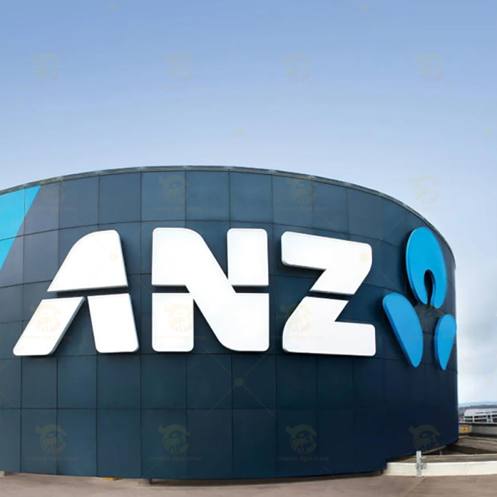
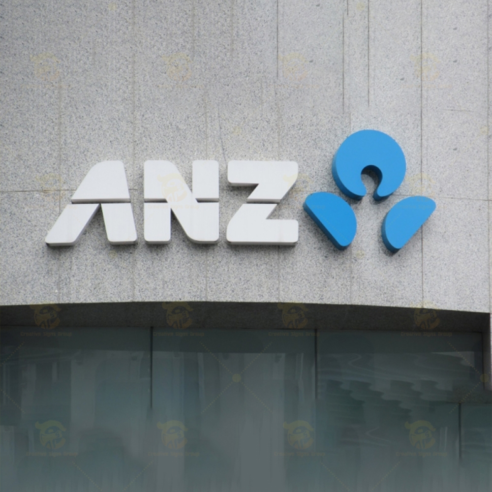
The current ANZ logo features a modern word-mark “ANZ”accompanied by an abstract symbol.
The symbol represents: Customers and people at the center
Three shapes symbolizing ANZ’s core regions: Australia, New Zealand , and Asia Pacific.
A sense of unity and growth across markets.
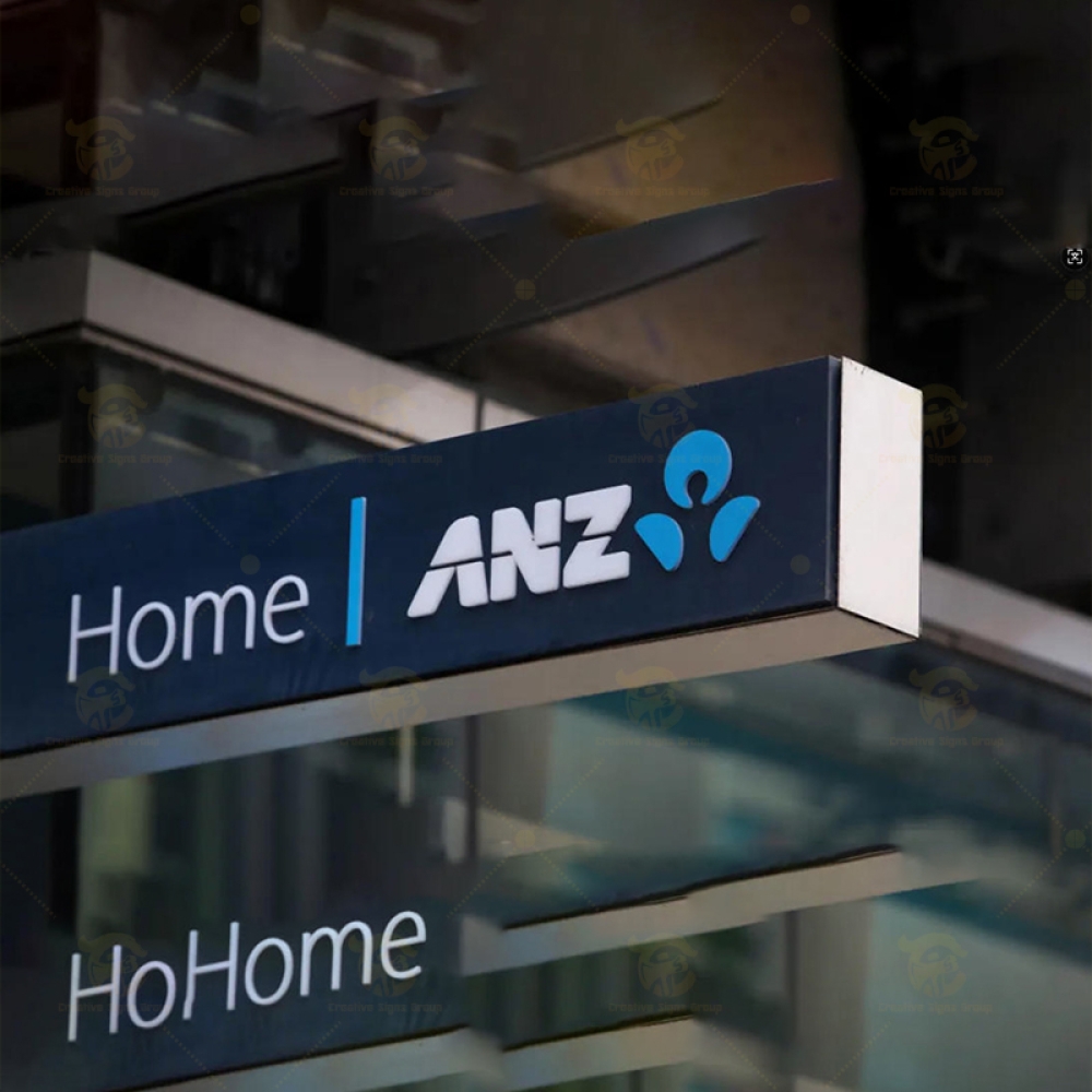
Signage & Corporate Identity
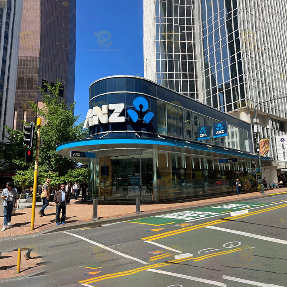
ANZ undertook a national signage rebrand, updating its branch signage to match new corporate colours and brand identity.
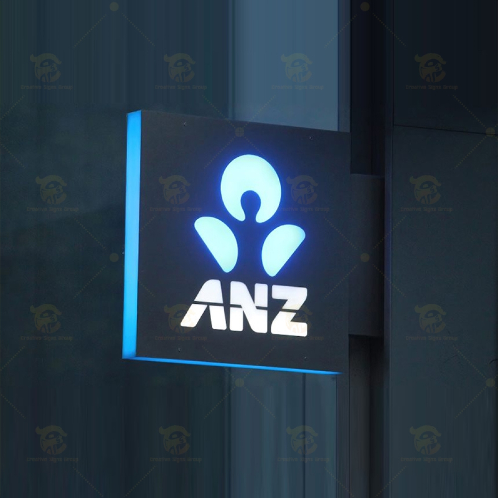
Signage often uses PERSPEX® acrylic for strong weatherability and colour stability, ensuring the ANZ blue matches its corporate Pantone® colour specification.
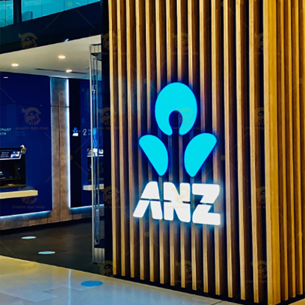
Exterior signs include large illuminated logos on branch exteriors, window graphics, and under-canopy banners.
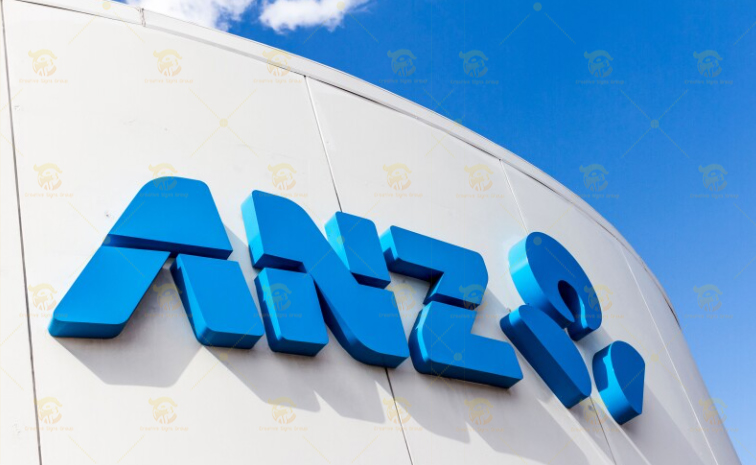
ANZ’s corporate signage frequently uses PERSPEX® acrylic, a specially colour-matched acrylic sheet that meets the bank’s exact Pantone® brand colours — especially for their blue logo signage. This material is chosen because:Excellent weatherability and long-term colour stability — suitable for both external façades and indoor signage.Colour matched grades ensure consistency under different lighting (natural vs artificial), reducing metamerism effects.Recyclable options and brand colour stability support sustainability goals.Typical uses include:Illuminated external ANZ logo signs.Backlit built-up lettering and letters.Directional and informational signage inside branches.
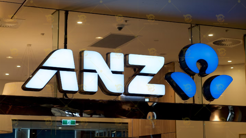 LED Components Many ANZ exterior signs use LED illumination behind or within the acrylic. LEDs are integrated with Perspex® Spectrum LED opal panels to evenly distribute light and enhance visibility. Secondary Structural Materials While acrylic forms the visible branded surface, the supporting structures incorporate:Aluminium composite panels or galvanized steel backing — for structural strength and weather resistance. Stainless steel or powder-coated metal trims — for framing and edges in exterior installations.
 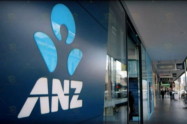 Interior Wayfinding Materials
 English
 Русский
 Español
 Français
 Nederlands
 Italiano
 Deutsch
 Bank
Bank Real Estate
 School
 Cafe
Cafe Restaurant
 Bar
Bar Supermarket
 Barber Shop
 Gas Station
 Shopping Center
 Drinks
 Food
Food Car
Car Cloth
Cloth Watch
Watch Medical
 Jewelry
 Electronic Equipment