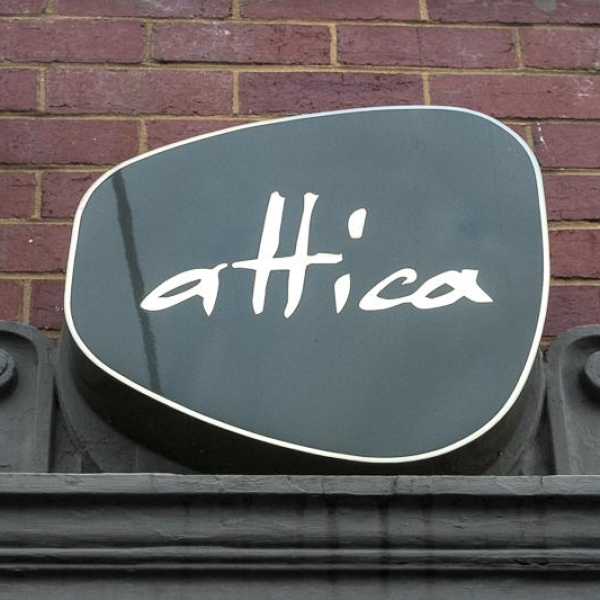
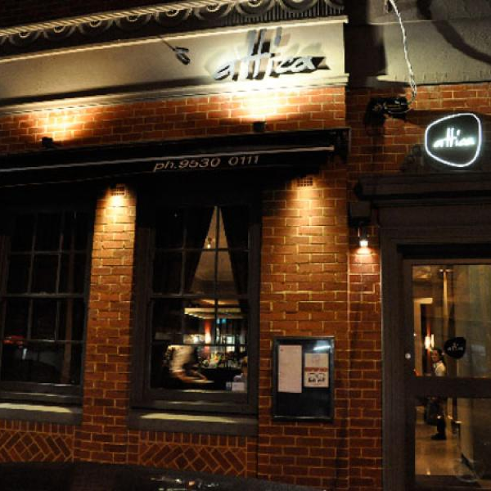
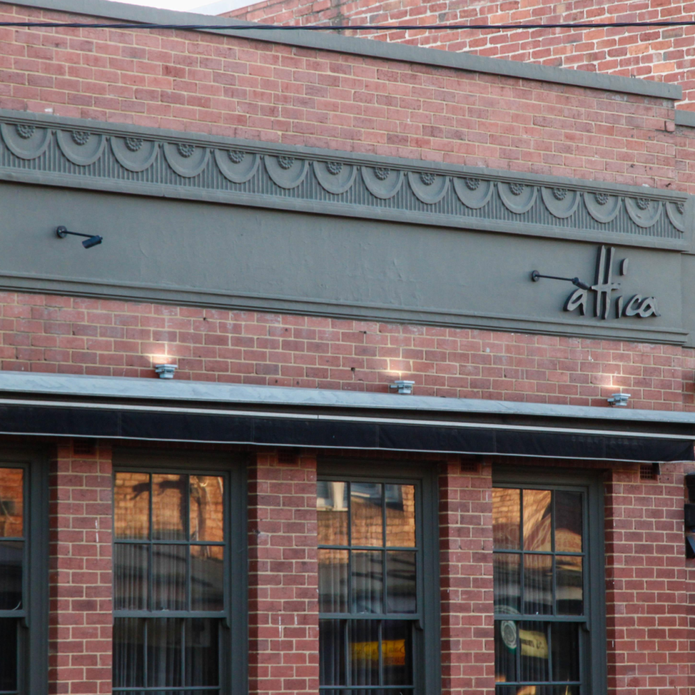
Signage Materials
Attica's restaurant signage commonly incorporates premium materials that complement its understated luxury aesthetic.
Premium Acrylic
High-quality acrylic is used for:
Illuminated logo signs
Interior feature displays
Reception signage
Wayfinding systems
The material is selected because of:
Excellent weather resistance
Long-term colour stability
High light transmission
Smooth premium finish
Its durability makes it suitable for both exterior and interior signage.
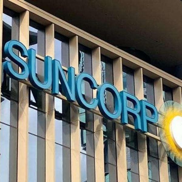
Stainless Steel Lettering
Stainless steel is widely used for:
Dimensional logo letters
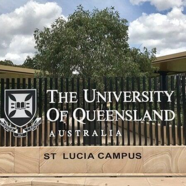
Entrance signage
Architectural branding elements
Advantages include:
Corrosion resistance
Contemporary appearance
Long service life
Premium finish
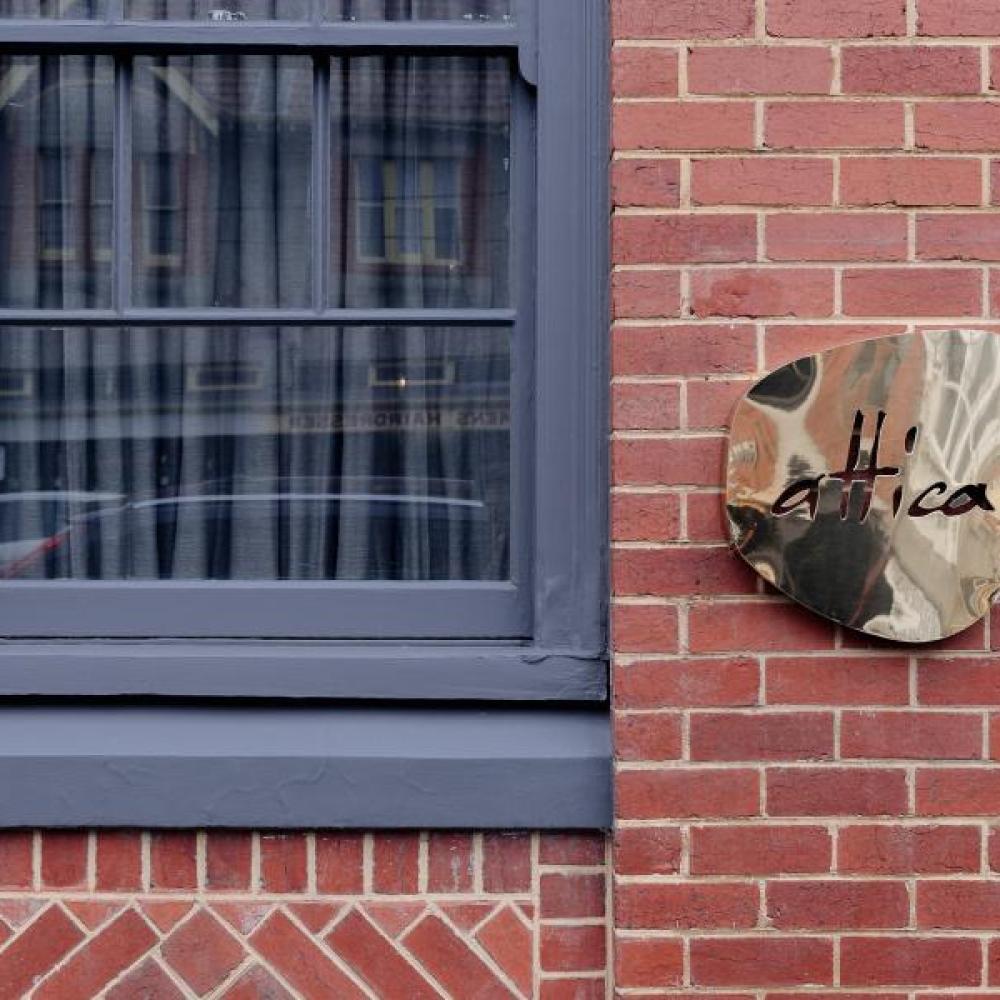
Brass Details
Brass is occasionally incorporated into interior branding and feature signage to create a warm and sophisticated atmosphere that complements the restaurant's luxury dining environment.
LED Components
Many Attica signage installations incorporate LED lighting behind or within acrylic and metal lettering.
LED systems provide:
Uniform light distribution
Enhanced night-time visibility
Low energy consumption
Long operating life
Typical applications include:
Illuminated entrance signage
Halo-lit dimensional letters
Reception feature walls
Interior branding displays
Secondary Structural Materials
While acrylic and stainless steel form the visible branding surfaces, the supporting structures typically include:
Aluminium Composite Panels (ACP)
Used for:
Architectural signage panels
Feature walls
Building-mounted branding
Advantages:
Lightweight construction
Excellent weather resistance
High structural stability
Galvanised Steel Framework
Provides:
Structural reinforcement
Long-term durability
Outdoor weather protection
Powder-Coated Metal Trims
Applied to:
Mounting frames
Edge detailing
Architectural finishing elements
These materials ensure both durability and a premium appearance.
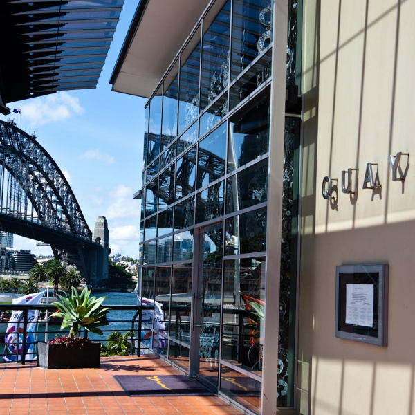
Interior Wayfinding Materials
Attica's interior directional and identification signage may incorporate:
Laser-cut acrylic panels with polished edges
Layered acrylic for dimensional effects
Glass graphics and etched glass panels
Custom metal plaques
Timber finishes that complement the restaurant's natural interior palette
These materials contribute to a seamless, elegant, and welcoming guest experience.
Manufacturing Advantages
Durability
Premium acrylic, stainless steel, brass, and aluminium provide excellent resistance to weathering, corrosion, and daily wear.
Brand Consistency
High-quality fabrication ensures consistent presentation of Attica's visual identity across all physical environments.
Architectural Integration
The signage is designed to integrate harmoniously with the restaurant's architecture, allowing the dining experience and interior design to remain the primary focus.
Visual Impact
LED-enhanced signage provides excellent visibility during both daytime and evening operation while maintaining a refined and understated appearance.
Premium Hospitality Experience
The combination of minimalist typography, high-quality materials, subtle lighting, and natural finishes reinforces Attica's reputation as one of Australia's most acclaimed fine-dining restaurants.
Typical Applications
Exterior restaurant signage
Entrance identification signs
Reception branding
Interior wayfinding systems
Feature walls
Private dining room signage
Window graphics
Menus and branded displays
Event and hospitality branding

 English
 Русский
 Español
 Français
 Nederlands
 Italiano
 Deutsch
 Bank
Bank Real Estate
 School
 Cafe
Cafe Restaurant
 Bar
Bar Supermarket
 Barber Shop
 Gas Station
 Shopping Center
 Drinks
 Food
Food Car
Car Cloth
Cloth Watch
Watch Medical
 Jewelry
 Electronic Equipment