Signage Materials
Premium Acrylic
High-quality acrylic materials are frequently used for:
Illuminated logo signs
Interior branding displays
Reception signage
Wayfinding systems
Benefits include:
Excellent colour consistency
Superior weather resistance
Long-term durability
High-quality illuminated effects
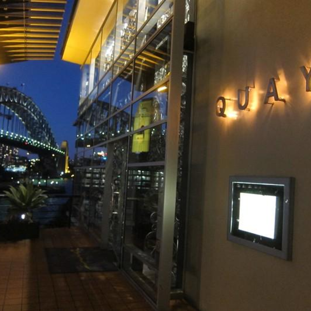
Stainless Steel Lettering
Stainless steel is commonly used for:
Dimensional letters
Entrance signage
Architectural branding elements
Advantages include:
Premium appearance
Corrosion resistance
Long service life
Modern aesthetic
Brass Finishes
Brass is often incorporated into luxury hospitality environments for:
Feature signs
Interior branding
Directional plaques
Benefits include:
Warm metallic appearance
Timeless elegance
High-end visual appeal
LED Illumination Components
Many Quay signage installations incorporate LED lighting systems behind or within acrylic and metal letterforms.
LED technology provides:
Uniform light distribution
Enhanced visibility
Energy efficiency
Long operational lifespan
Typical applications include:
Illuminated exterior logo signs
Halo-lit dimensional letters
Reception feature walls
Interior branding displays
Structural Support Materials
While acrylic and metal finishes create the visible branded surfaces, the supporting structures commonly include:
Aluminium Composite Panels (ACP)
Used for:
Feature walls
Architectural signage panels
Building-mounted branding systems
Advantages:
Lightweight construction
Structural stability
Weather resistance
Galvanised Steel Framework
Provides:
Long-term structural support
Durability in outdoor environments
Enhanced installation strength
Powder-Coated Metal Components
Used for:
Mounting frames
Edge trims
Architectural detailing
These materials provide both durability and a premium finish.
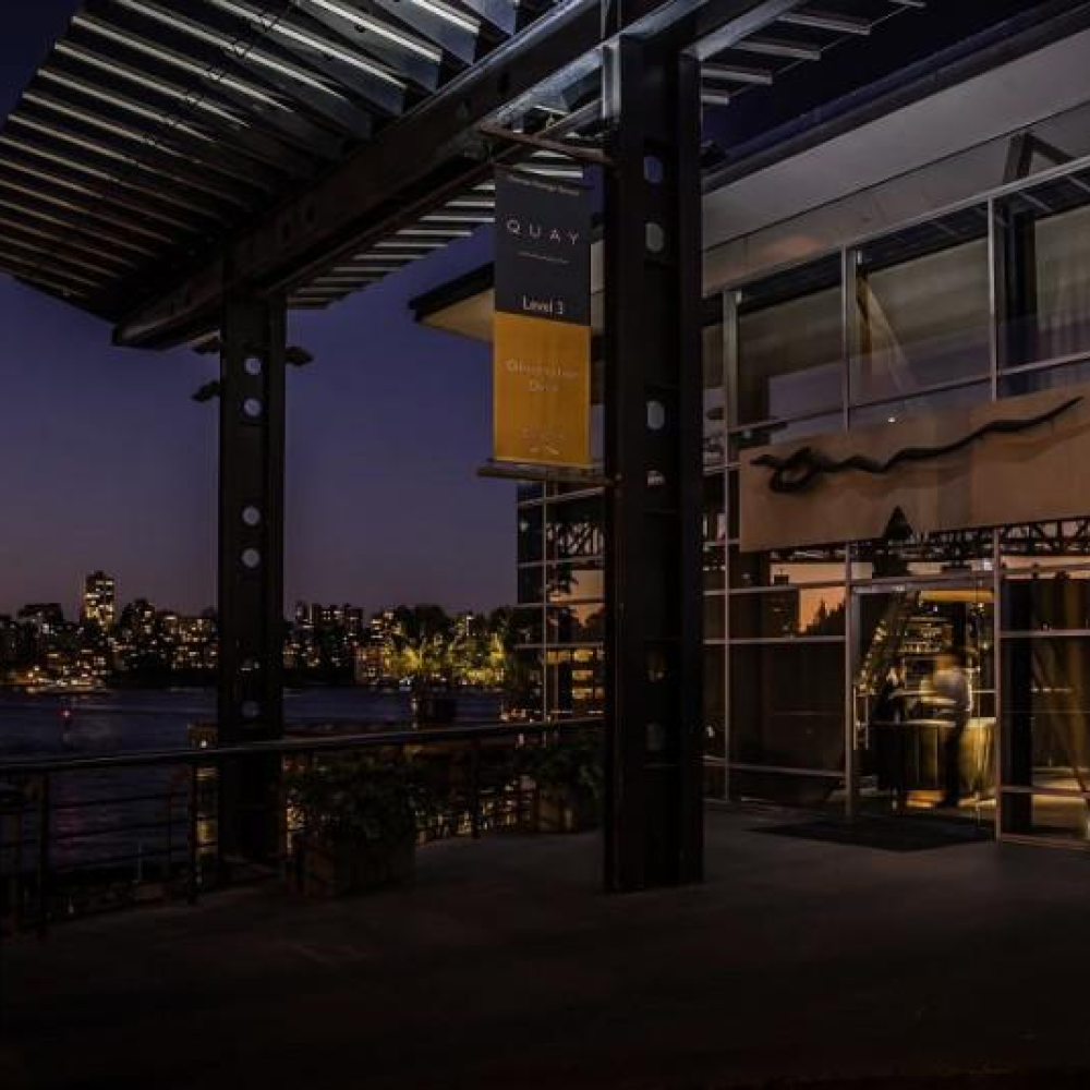
Interior Wayfinding Solutions
For interior directional and information signage, fabrication may include:
Laser-cut acrylic panels with polished edges
Layered acrylic systems for dimensional effects
Glass graphics and etched glass signage
Custom metal plaques and room identification signs
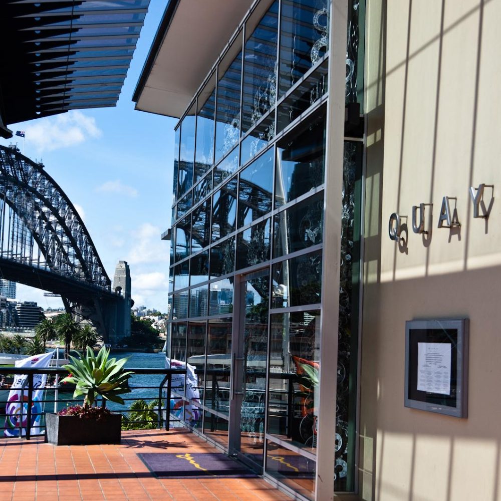
These materials contribute to a seamless and sophisticated guest experience throughout the restaurant.
Manufacturing Advantages
Durability
Premium acrylic, stainless steel, brass, and aluminium materials provide excellent resistance to weathering, corrosion, and everyday wear.
Brand Consistency
High-quality fabrication ensures that Quay's visual identity remains consistent across all physical and digital touchpoints.
Architectural Integration
Signage is designed to complement the restaurant's architecture and its iconic Sydney Harbour location without overwhelming the surrounding environment.
Visual Impact
LED-enhanced signage creates strong visibility during both daytime and nighttime operation while maintaining a refined luxury appearance.
Premium Guest Experience
The combination of minimalist typography, high-quality materials, and subtle illumination reinforces Quay's reputation as a world-class fine-dining destination.
Typical Applications
Exterior restaurant signage
Entrance identification signs
Reception branding
Interior wayfinding systems
Feature walls
Private dining room signage
Window graphics
Event branding and promotional displays
 English
 Русский
 Español
 Français
 Nederlands
 Italiano
 Deutsch
 Bank
Bank Real Estate
 School
 Cafe
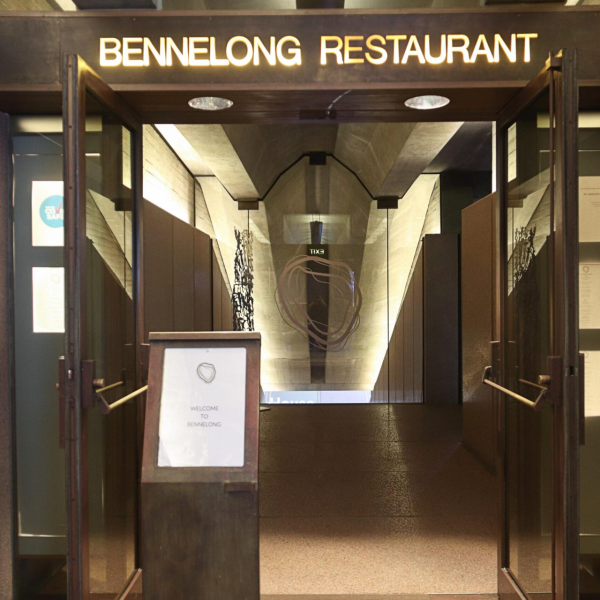
Cafe Restaurant
 Bar
Bar Supermarket
 Barber Shop
 Gas Station
 Shopping Center
 Drinks
 Food
Food Car
Car Cloth
Cloth Watch
Watch Medical
 Jewelry
 Electronic Equipment