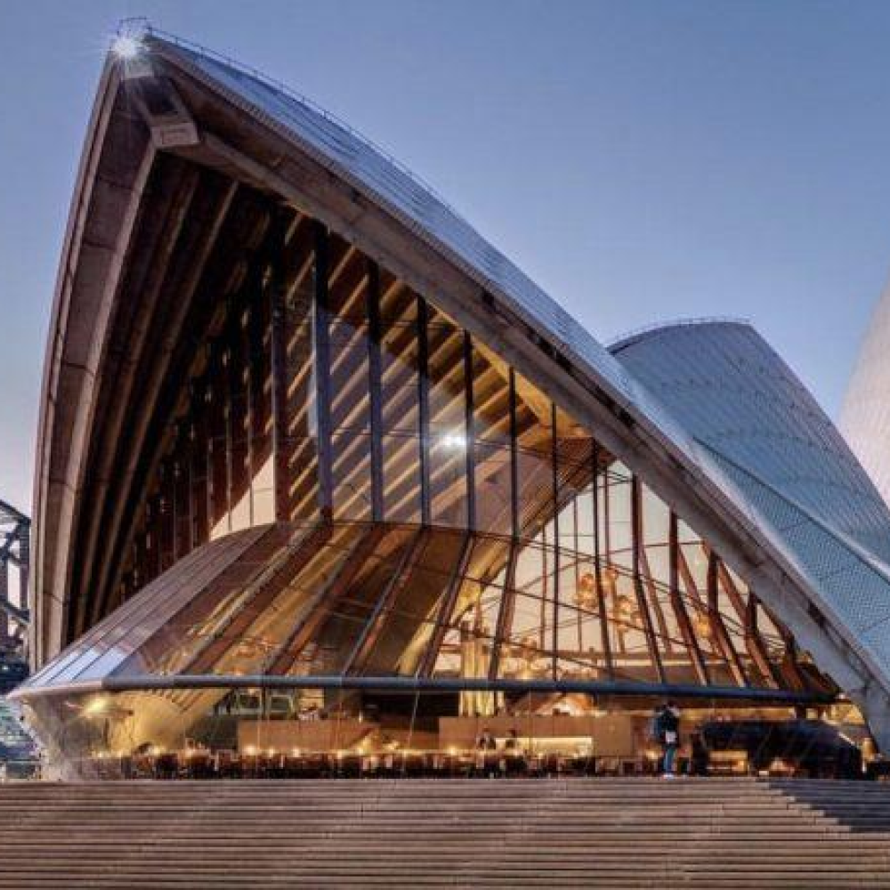
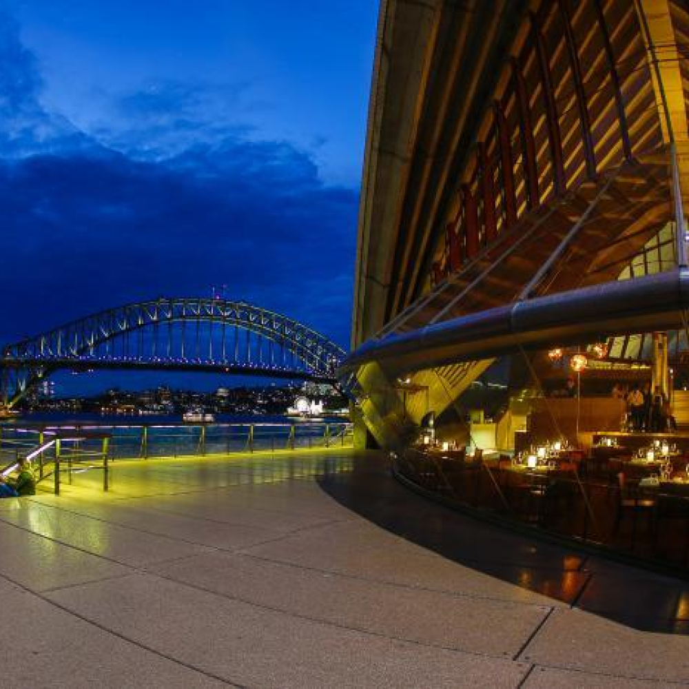
Bennelong is one of Australia's most iconic fine-dining restaurants, located inside the world-famous Sydney Opera House and led by renowned Australian chef Peter Gilmore.
The restaurant is named after Woollarawarre Bennelong, an important leader of the Eora Nation and one of the earliest Aboriginal Australians to engage with British settlers in Sydney.
As a result, Bennelong represents:
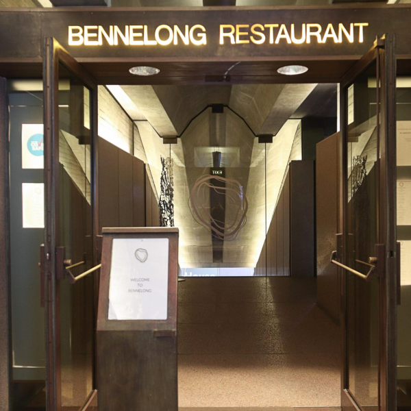
Bennelong primarily uses a simple and elegant wordmark logo featuring:
BENNELONG
displayed in uppercase lettering.
Key characteristics include:
This approach aligns with modern premium hospitality branding.
Because the restaurant is located within the Sydney Opera House, the brand does not rely on a complex graphic symbol.
The philosophy is:
The Opera House itself is the visual icon.
Therefore, the logo emphasizes:
allowing the building to remain the focal point of the brand experience.
The name "Bennelong" itself is a powerful brand asset.
It symbolizes:
This gives the restaurant a strong sense of place and authenticity.
The typography is typically refined and understated, often featuring:
These elements communicate:
Bennelong traditionally uses a restrained colour palette:
with occasional use of:
Logo Design Characteristics
Wordmark Logo
Symbolic Meaning of the Logo
1. Reflection of the Sydney Opera House
2. Australian Cultural Identity
3. Modern Fine Dining
Brand Colours
Black and White
Gold as an accent colour.
LED-illuminated lettering for enhanced visibility.
Signage integrated seamlessly into the building environment.
A branding system designed for luxury dining experiences.
Used for dimensional letters and premium finishes.
Used for illuminated logo applications.
Provides a sophisticated and timeless appearance.
Used for backlit and halo-lit signage systems.
Applied to windows, partitions, and entry areas.
The Bennelong brand identity is commonly used across:
The simple wordmark structure is efficient to manufacture while maintaining a premium appearance.
Brass, stainless steel, and acrylic effectively communicate luxury and refinement.
The signage complements the Sydney Opera House without competing with its iconic architecture.
Even without a graphic symbol, the name:
BENNELONG
instantly evokes associations with the Sydney Opera House, Sydney Harbour, and world-class Australian dining.
 English
 Русский
 Español
 Français
 Nederlands
 Italiano
 Deutsch
 Bank
Bank Real Estate
 School
 Cafe
Cafe Restaurant
 Bar
Bar Supermarket
 Barber Shop
 Gas Station
 Shopping Center
 Drinks
 Food
Food Car
Car Cloth
Cloth Watch
Watch Medical
 Jewelry
 Electronic Equipment